Dashboard visualizations types
This article outlines the types of visualizations available to use in AI/BI dashboards and shows you how to create an example of each visualization type. For instructions on building a dashboard, see Create a dashboard. You can use natural language to prompt the assistant to create bar, line, scatter, pie, and counter charts. See Create visualizations with Databricks Assistant.
Note
To optimize performance, charts can only render 10K rows or 10MB on the canvas, whichever is smaller. Otherwise, visualizations can be truncated.
Area visualization
Area visualizations combine the line and bar visualizations to show how one or more groups’ numeric values change over the progression of a second variable, typically that of time. They are often used to show sales funnel changes through time.
To adjust the layout:
Click the
 kebab menu in the Y Axis section of the visualization editing panel.
In the Layout section, choose Stack or 100% Stack.

Configuration values: For the provided area visualization example, the following values were set:
Dataset: TPCH orders
Visualization: Area
Title:
Total price and order year by order priority and clerkX-axis:
Field:
o_orderdateScale Type:
TemporalTransform:
YearlyAxis title:
Order year
Y-axis:
Field:
o_totalpriceAxis title:
Total priceScale Type:
QuantitativeTransform:
Sum
Group by:
Field:
o_orderpriorityLegend title:
Order priority
Filter
Field:
TPCH orders.o_clerk
SQL query: For this area visualization, the following SQL query was used to generate the data set named TPCH orders.
SELECT * FROM samples.tpch.orders
Bar chart
Bar charts represent the change in metrics over time or across categories and show proportionality, similar to a pie visualization.

To adjust the layout:
Click the
 kebab menu in the Y Axis section of the visualization editing panel.
In the Layout section, choose Stack or 100% Stack, or Group.
Configuration values: For the provided bar chart example, the following values were set:
Dataset: TPCH orders
Visualization: Bar
Title:
Total price and order month by order priority and clerkX-axis:
Field:
o_orderdateTransform:
MonthlyScale Type:
TemporalAxis title:
Order month
Y-axis:
Field:
o_totalpriceScale Type:
QuantitativeTransform:
SumAxis title:
Total price
Group by:
Field:
o_orderpriorityLegend title:
Order priority
Filter
Field:
TPCH orders.o_clerk
SQL query: The following SQL query generated the data set TPCH orders for this bar visualization.
SELECT * FROM samples.tpch.orders
Box chart
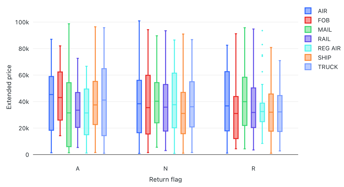
The box chart visualization shows the distribution summary of numerical data, optionally grouped by category. Using a box chart visualization, you can quickly compare the value ranges across categories and visualize the locality, spread, and skewness groups of the values through their quartiles. In each box, the darker line shows the interquartile range. For more information about interpreting box plot visualizations, see the Box chart article on Wikipedia.

For the provided box chart example, the following values were set:
X column (dataset column):
l-returnflagY columns (dataset column):
l_extendedpriceX axis title:
Return flag1Y axis title:
Extended price
SQL query: For this box chart visualization, the following SQL query was used to generate the data set.
select * from samples.tpch.lineitem
Bubble chart
Bubble charts are scatter charts where the size of each point marker reflects a relevant metric. To make a bubble chart, select Scatter as your visualization type. In the Size setting, select the metric you want represented by the size of the markers.

Configuration values: For the provided bubble chart example, the following values were set:
Dataset: NYC taxi trips
Visualization: Scatter
Title:
Trip distance, fares, and trip durationX-axis:
Field:
trip_distanceScale type:
QuantitativeTransform:
None
Y-axis:
Field:
fare_amountScale type:
QuantitativeTransform:
None
Color by:
Field:
pickup_zip
Size:
Field:
time_spentTransform:
None
Combo chart
Combo charts combine line and bar charts to present the changes over time with proportionality.

Configuration values: For this combo chart visualization, the following values were set:
Dataset: partsupp
Visualization: Combo
X-axis:
ps_partkeyScale Type:
Quantitative
Y-axis:
Bar:
ps_availqtyAggregation type:
SUMLine:
ps_supplycostAggregation type:
AVG
Color by Y-Series:
Sum of ps_availqtyAverage ps_supplycost
SQL query: For this combo chart visualization, the following SQL query was used to generate the data set.
SELECT * FROM samples.tpch.partsupp
Dual-axis combo chart
You can use combo charts to show two different y-axes. With your combo chart widget selected, click the  kebab menu on the Y axis settings in the chart configuration panel. Turn on the Enable dual axis option.

Configuration values: For this combo chart, the Enable dual axis option is on. The other configurations are set as follows:
Dataset: Trips
Visualization: Combo
X-axis:
tpep_pickup_datetimeScale Type:
TemporalTransform:
Weekly
Y-axis:
Left Y-axis (Bar):
trip_distanceTransform:
AVG
Right Y-axis (Line):
fare_amountTransform:
AVG
Color by Y-series:
Average trip_distanceAverage fare_amount
SQL query: The following SQL query was used to generate the data set:
SELECT * FROM samples.nyctaxi.trips
Counter visualization
Counters display a single value prominently, with an option to compare them against a target value. To use counters, specify which row of data to display on the counter visualization for the Value Column and Target Column.

You can set conditional formatting and customize the text style in the Value configuration details.

Configuration values: For this counter visualization example, the following values were set:
Dataset: TPCH orders
Visualization: Counter
Title:
Orders: Target amount vs. actual amount by dateValue:
Field:
avg(o_totalprice)Value row number: 1
Target:
Field:
avg(o_totalprice)Value row number: 2
Filter
Field:
TPCH orders.o_orderdate
SQL query: For this counter visualization, the following SQL query was used to generate the data set named TPCH orders_target.
SELECT o_orderdate, avg(o_totalprice)
FROM samples.tpch.orders
GROUP BY 1
ORDER BY 1
Line visualization
Line visualizations present the change in one or more metrics over time.

Configuration values: For this line visualization example, the following values were set:
Dataset: TPCH orders
Visualization: Line
Title:
Average price and order year by order priority and clerkX-axis:
Field:
o_orderdateTransform:
YearlyScale Type:
TemporalAxis title:
Order year
Y-axis:
Field:
o_totalpriceTransform:
AverageScale Type:
QuantitativeAxis title:
Average price
Group by:
Field:
o_orderpriorityLegend title:
Order priority
Filter
Field:
TPCH orders.o_clerk
SQL query: For this bar visualization visualization, the following SQL query was used to generate the data set named TPCH orders.
SELECT * FROM samples.tpch.orders
Heatmap chart
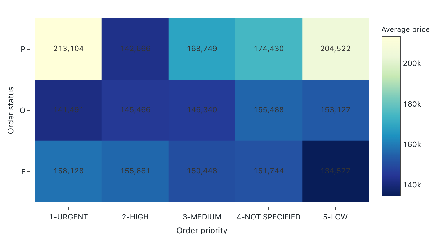
Heatmap charts blend features of bar charts, stacking, and bubble charts allowing you to visualize numerical data using colors. A common color palette for a heatmap shows the highest values using warmer colors, like orange or red, and the lowest values using cooler colors, like blue or purple.
For example, the following heatmap visualizes the most frequently occurring distances of taxi rides on each day and groups the results by the day of the week, distance, and total fare.
Note
Heatmaps can display up to 64K rows or 10MB.

Configuration values: For this heatmap chart visualization, the following values were set:
Dataset: TPCH orders
Visualization: Heatmap
X column (dataset column):
o_orderpriorityY columns (dataset column):
o_orderstatusColor column:
Dataset column:
o_totalpriceAggregation type:
Average
X-axis name (override default value):
Order priorityY-axis name(override default value):
Order statusColor scheme (override default value):
YIGnBu
SQL query: For this heatmap chart visualization, the following SQL query was used to generate the data set.
SELECT * FROM samples.tpch.orders
Histogram chart
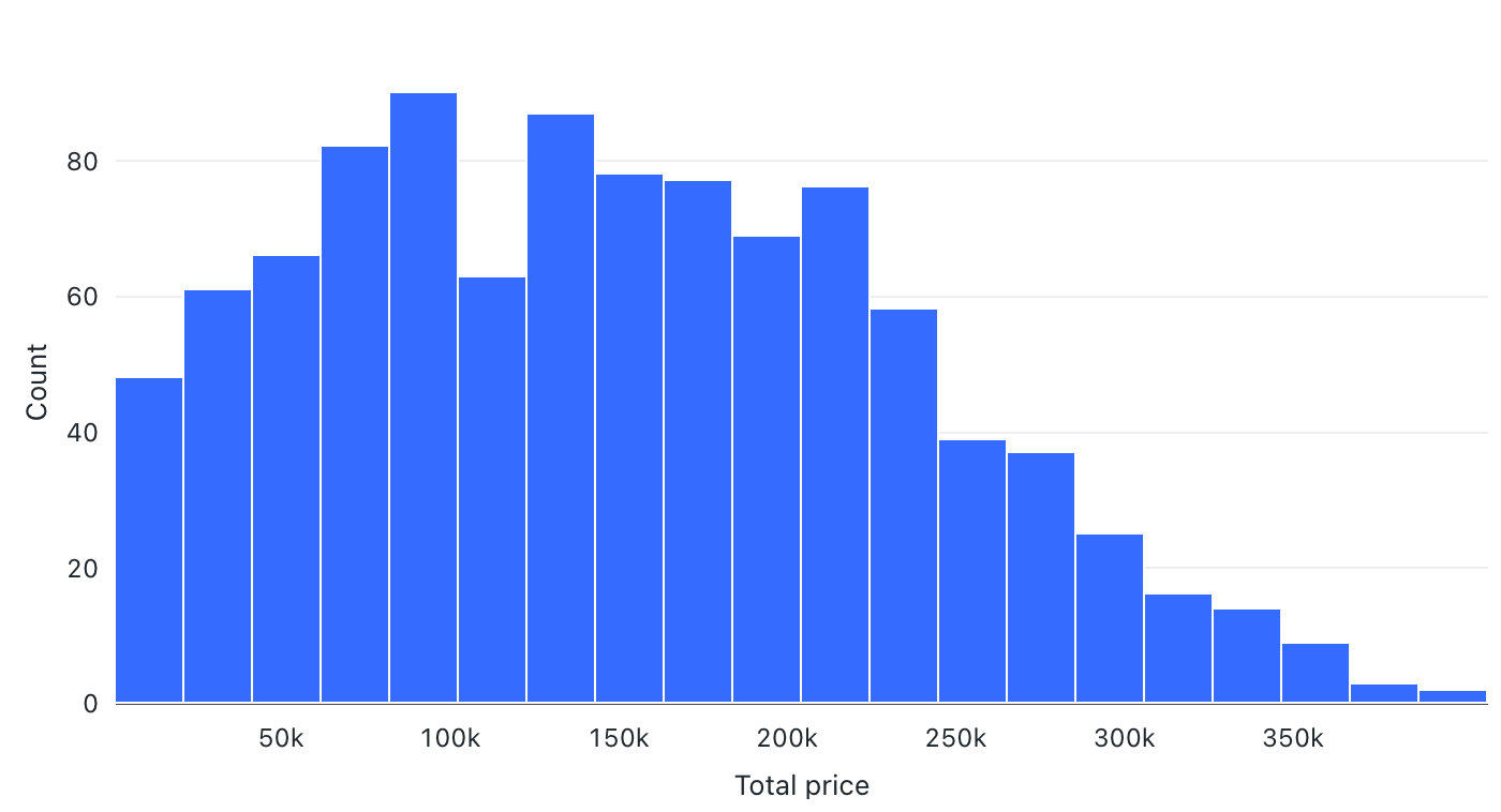
A histogram plots the frequency that a given value occurs in a dataset. A histogram helps you to understand whether a dataset has values that are clustered around a small number of ranges or are more spread out. A histogram is displayed as a bar chart in which you control the number of distinct bars (also called bins).

Configuration values: For this histogram chart visualization, the following values were set:
Dataset: TPCH orders
Visualization: Histogram
X column (dataset column):
o_totalpriceNumber of bins: 20
X-axis name (override default value):
Total price
Configuration options: For histogram chart configuration options, see histogram chart configuration options.
SQL query: For this histogram chart visualization, the following SQL query was used to generate the data set.
select * from samples.tpch.orders
Pie visualization
Pie visualizations show proportionality between metrics. They are not meant for conveying time series data.

Configuration values: For this pie visualization example, the following values were set:
Dataset: TPCH orders
Visualization: Pie visualization
Title:
Total price by order priority and clerkAngle:
Field:
o_totalpriceTransform:
SumAxis title:
Total price
Group by:
Field:
o_orderpriorityLegend title:
Order priority
Filter
Field:
TPCH orders.o_clerk
SQL query: For this pie visualization, the following SQL query was used to generate the data set named TPCH orders.
SELECT * FROM samples.tpch.orders
Pivot visualization
A pivot visualization aggregates records from a query result into a tabular display. It’s similar to PIVOT or GROUP BY statements in SQL. You configure the pivot visualization with drag-and-drop fields.
Note
For performance reasons, pivot tables only support rendering 100 columns x 100 rows.

Configuration values: For this pivot visualization example, the following values were set:
Dataset: TPCH lineitem
Visualization: Pivot
Title:
Line item quantity by return flag and ship mode by supplierRows:
Field:
l_returnflag
Columns:
Field:
l_shipmode
Cell
Dataset:
Field:
l_quantityTransform: Sum
Filter
Field:
TPCH lineitem.l_supplierkey
SQL query: For this pivot visualization, the following SQL query was used to generate the data set named TPCH lineitem.
SELECT * FROM samples.tpch.lineitem
Point map
Point maps display quantitative data as symbols placed at specific map locations. Markers are positioned using latitude and longitude coordinates, which must be included as part of the result set for this chart type. The following example uses data from motor vehicle collisions in New York, NY.

Configuration values: For this point map visualization, the following values were set:
Dataset: motor vehicle collisions
Visualization: Symbol map
Coordinates:
Latitude:
LATITUDELongitude:
LONGITUDE
Color/Group by:
Field:
CONTRIBUTING FACTOR
Note
No Databricks datasets include latitude or longitude data, so a sample SQL query is not provided for this example.
Scatter visualization
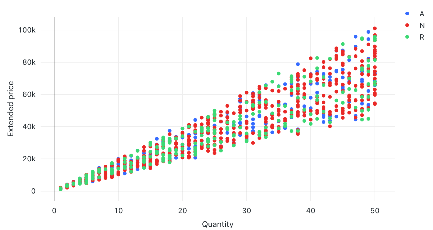
Scatter visualizations are commonly used to show the relationship between two numerical variables. You can encode the third dimension with color to show how the numerical variables differ across groups.

Configuration values: For this scatter visualization example, the following values were set:
Dataset: TPCH lineitem
Visualization: Scatter
Title:
Total price and quantity by ship mode and supplierX-axis:
Field:
l_quantityAxis title:
QuantityScale type:
QuantitativeTransform:
None
Y-axis:
Field:
l_extendedpriceScale type:
QuantitativeTransform:
NoneAxis title:
Price
Group by:
Field:
l_shipmodeLegend title:
Ship mode
Filter
Field:
TPCH lineitem.l_supplierkey
SQL query: For this scatter visualization, the following SQL query was used to generate the data set named TPCH lineitem.
SELECT * FROM samples.tpch.lineitem
Table visualization
The table visualization shows data in a standard table but allows you to manually reorder, hide, and format the data.
Note
Tables can display up to 64K rows or 10MB.

Configuration values: For this table visualization example, the following values were set:
Dataset: TPCH lineitem
Visualization: Table
Title:
Line item summary by supplierColumns:
Display row number: Enabled
Field:
l_orderkeyField:
l_extendedpriceDisplay as:
NumberNumber format: $0.00
Field:
l_discountDisplay as:
NumberNumber format: %0.00
Field:
l_taxDisplay as:
NumberNumber format: %0.00
Field:
l_shipdateField:
l_shipmode
Filter
Field:
TPCH lineitem.l_supplierkey
SQL query: For this table visualization, the following SQL query was used to generate the data set named TPCH lineitem.
SELECT * FROM samples.tpch.lineitem