Dashboard visualizations
This article explains how to use and customize visualization widgets on AI/BI dashboards.
Configure a chart
After adding a visualization widget to the canvas, the Visualization Configuration panel appears on the right side of the screen. By default, the first dataset listed on the Data tab is selected, and the default visualization type is a Bar chart.
To create a chart, use the following steps:
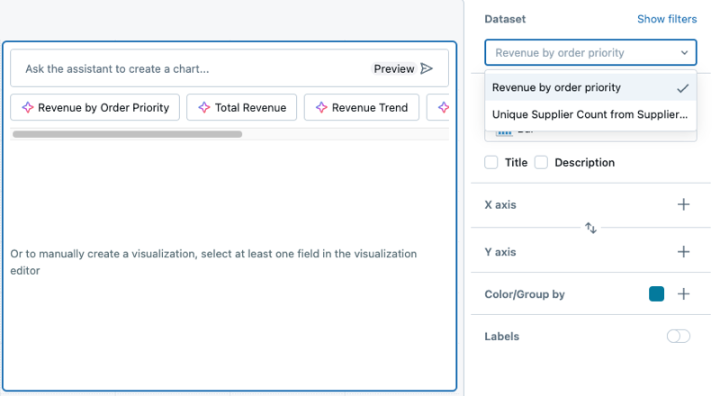
Select a dataset: Use the Dataset drop-down to choose the dataset for your visualization.
Add filters (optional): Click Show filters to apply a static filter or parameter to your visualization. You can filter on any field. If your dataset includes a parameter, an option to apply it will also appear.
Choose a visualization type: Select a visualization type from the Visualization drop-down menu. For details about available visualization types and their configurations, see Dashboard visualizations types.
Define x-axis and y-axis fields: After selecting a dataset, choose the fields to display on the x-axis and y-axis.
Note
If you use the Databricks Assistant to generate a chart, the dataset and visualization selections automatically adjust based on your request. For step-by-step guidance on creating AI-assisted visualizations, see Create visualizations with Databricks Assistant.
Apply chart formatting
Charts include customizable formatting options for axes, colors, labels, and tooltips. Formatting options vary by chart type and dataset values.
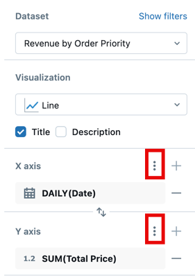
The following screenshot highlights the kebab menus used for formatting the x and y axes.
Format axis settings
You can format each axis using the following settings.
X-axis formatting
To format the x-axis:
Click the
 kebab menu in the X Axis section of the visualization editing panel.
Configure the following settings:
Show axis title: Enabled by default. Enter a custom title or clear the checkbox to hide the axis title.
Show axis values: Enabled by default. Clear the checkbox to hide axis values.
Format: Click Format to view additional formatting options. Auto automatically formats your chart and is selected by default. You can customize formatting for date and numeric fields. Click Custom to see additional formatting options. For details about formatting numeric fields, see Format numeric values.
Y-axis formatting
To format the y-axis:
Click the
kebab menu in the Y Axis section.Configure the following settings:
Show axis title: Enabled by default. Enter a custom title or clear to hide it.
Show axis values: Enabled by default. Clear the checkbox to hide axis values.
Range: Optionally, enter values into the Minimum and Maximum fields to define a custom range.
Reverse Axis: Select to display values in reverse order.
Scale Function: Choose between Linear or Log (Symmetric) scales.
Format: Click Format to view additional formatting options. Auto automatically formats your chart and is selected by default. You can customize formatting for date and numeric fields. Click Custom to see additional formatting options. For details about formatting numeric fields, see Format numeric values.
Note
If any of the listed options are unavailable, they cannot be applied to the selected chart type.
Format numeric values
You can format numbers for axis tick labels, data labels, and tooltips. To access formatting options:
Click the
kebab menu next to X Axis or Y Axis in the chart configuration panel.Click Format and choose from the following options:
Type: None, Currency ($), Percentage (%)
Abbreviation: None, Compact, Scientific
Decimal places: Max, Exact, All, or a custom number of places
Group separator: Optionally, include a comma or other separator.
Note
Different currency formats are available. After selecting Currency, choose your preferred option from the drop-down menu.
Customize chart elements
You can format chart legends, colors, tooltips, and value labels.
Chart colors
To change chart colors:
Click a color in the chart to open the color picker.
Enter a HEX or RGB value for an exact color.
Click the
kebab menu in the Color/Group by section to adjust the opacity of all colors.
Legend
Click the kebab menu in the Color/Group by section to show options for changing the visibility, title, or position of the chart legend. The following options are available:
Show legend: Use the checkbox to show or hide the legend.
Show legend title: Use the checkbox to show or hide the legend title. When the title is visible, you can type to override the default value, which is the column name.
Legend position: Use the drop-down to adjust the legend’s placement in the visualization widget.
Tooltips
Tooltips display precise measures of the data under the pointer. By default, they show values from the x-axis, y-axis, and any color/grouping fields. To add more fields to a tooltip:
Click the + button in the Tooltip section of the visualization editor.
Use the drop-down to select additional fields, or use the text entry box to search by name.
Note
If the Tooltip section is not present in the visualization editor, that chart type does not support tooltip customization.